Color consultation
Color Harmony
Color consultation project enhancing mood, balance, and visual appeal through cohesive palette selection.
Client
Ava
Year
Style
Other
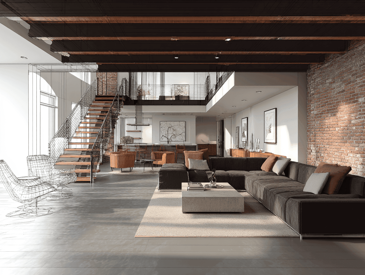
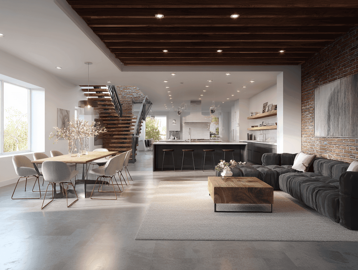
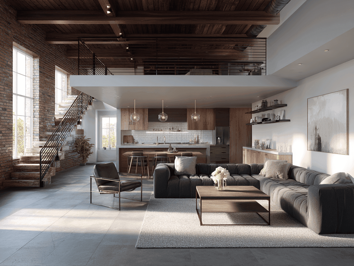
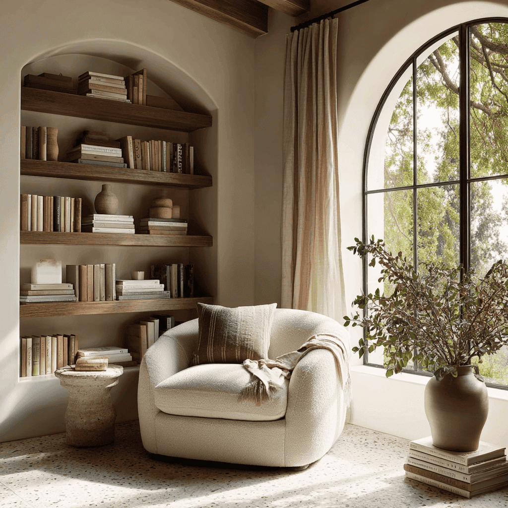
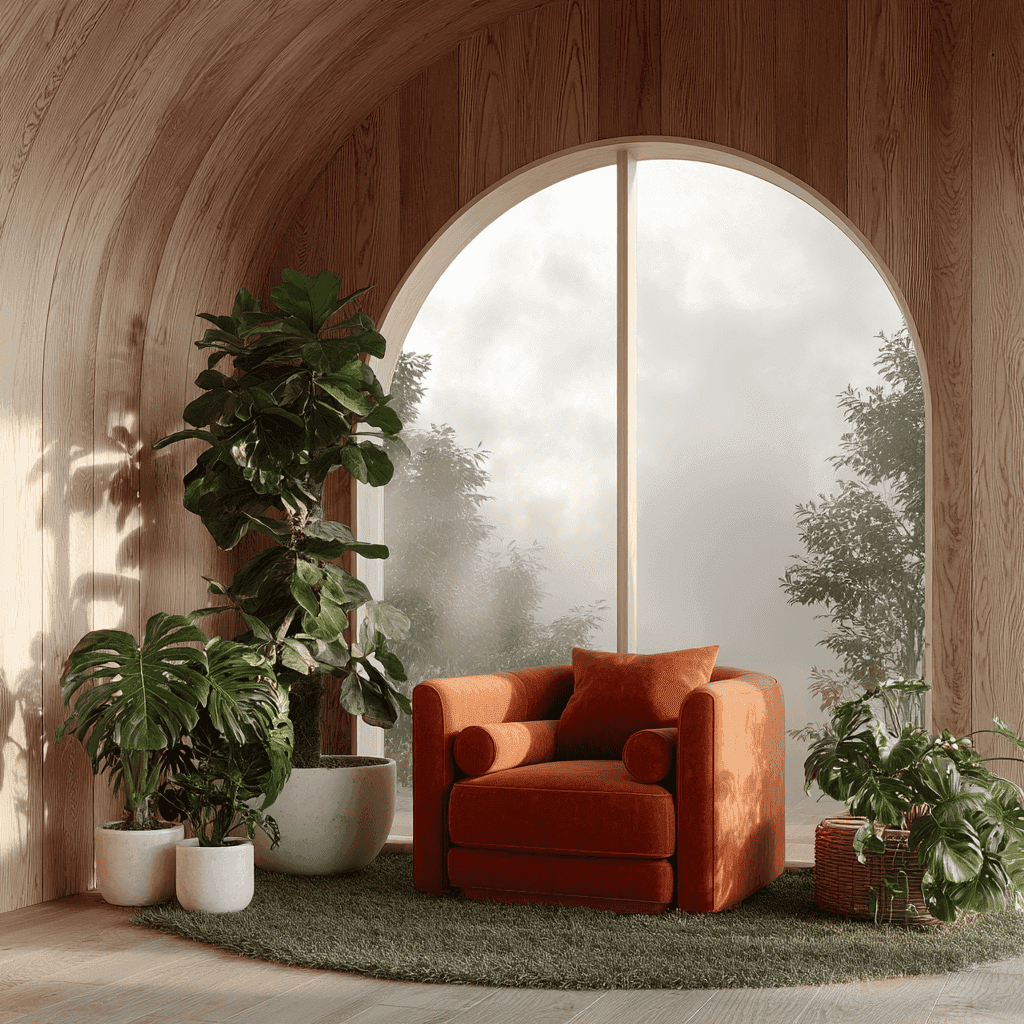
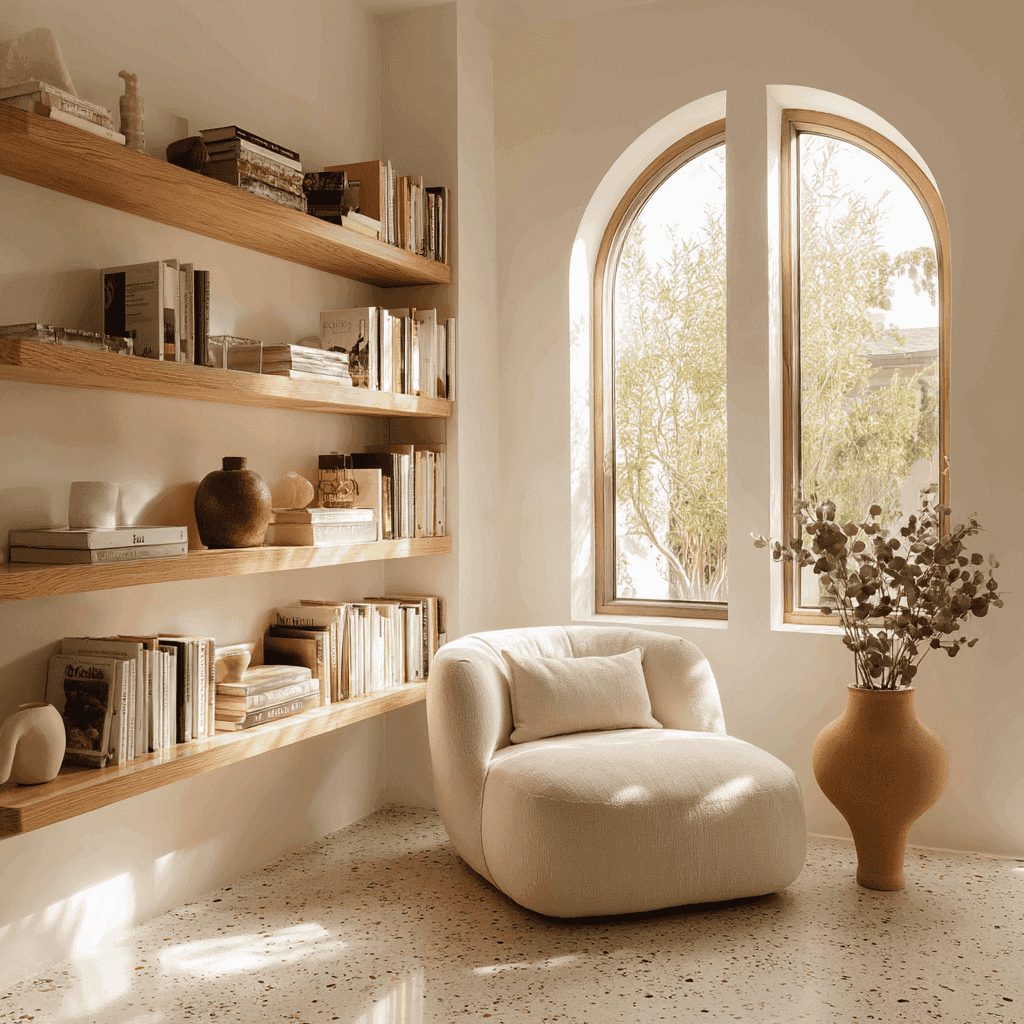
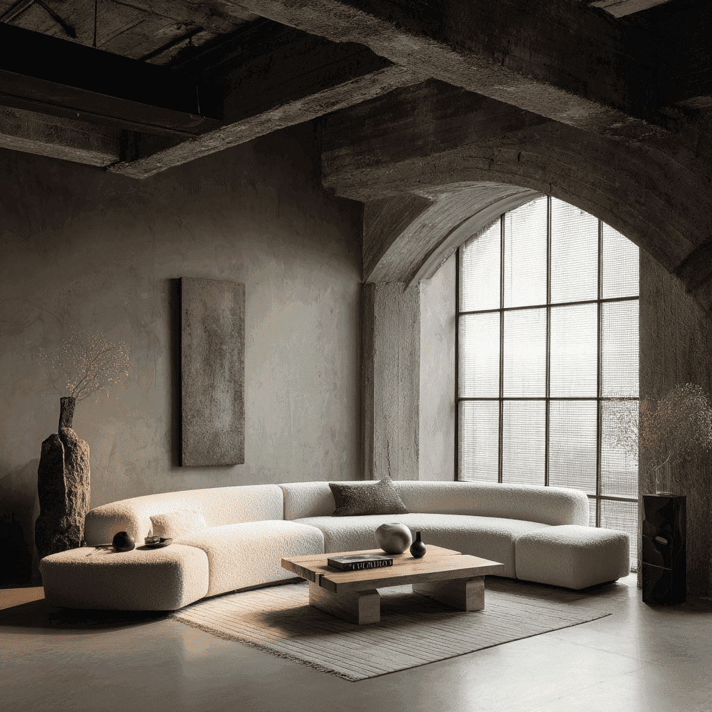
This project focused on redefining the interior through a carefully curated color palette that enhances mood and visual harmony. The selected tones work together to create a balanced and inviting environment while reflecting the client’s personality and design preferences.
Project Requirements
The client needed a cohesive color strategy that enhances mood, complements existing elements, and creates a visually balanced interior without overwhelming the space or disrupting the overall design flow.
Select cohesive and balanced color palettes
Enhance mood through strategic color usage
Complement existing furniture and materials
Maintain consistency across all interior areas
Reflect client personality within color choices
Design Approach
We developed a color palette that balances warmth and neutrality, ensuring harmony across all elements. Each shade was carefully selected based on lighting conditions and existing materials to maintain consistency. The approach focused on enhancing mood while supporting the overall design concept. Subtle contrasts and coordinated tones were used to create depth and visual interest, resulting in a refined and cohesive interior environment.